PowerPoints
PowerPoint
Creating accessible PowerPoint presentations is covered in Module 2. WebAIM also has a good online guide to Accessible PowerPoint.
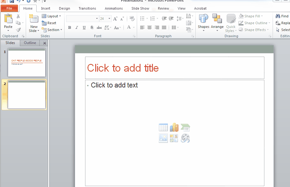
From Module 2: "The most important thing that you need to remember when using PPT, is to use the layout templates provided in PowerPoint. That means avoid adding any text boxes or adding items on top of the content boxes already provided in the layout templates. The reason behind this is because screen readers may jump over/ignore items, like text boxes, that are added to the pages and exist outside of the content boxes provided."
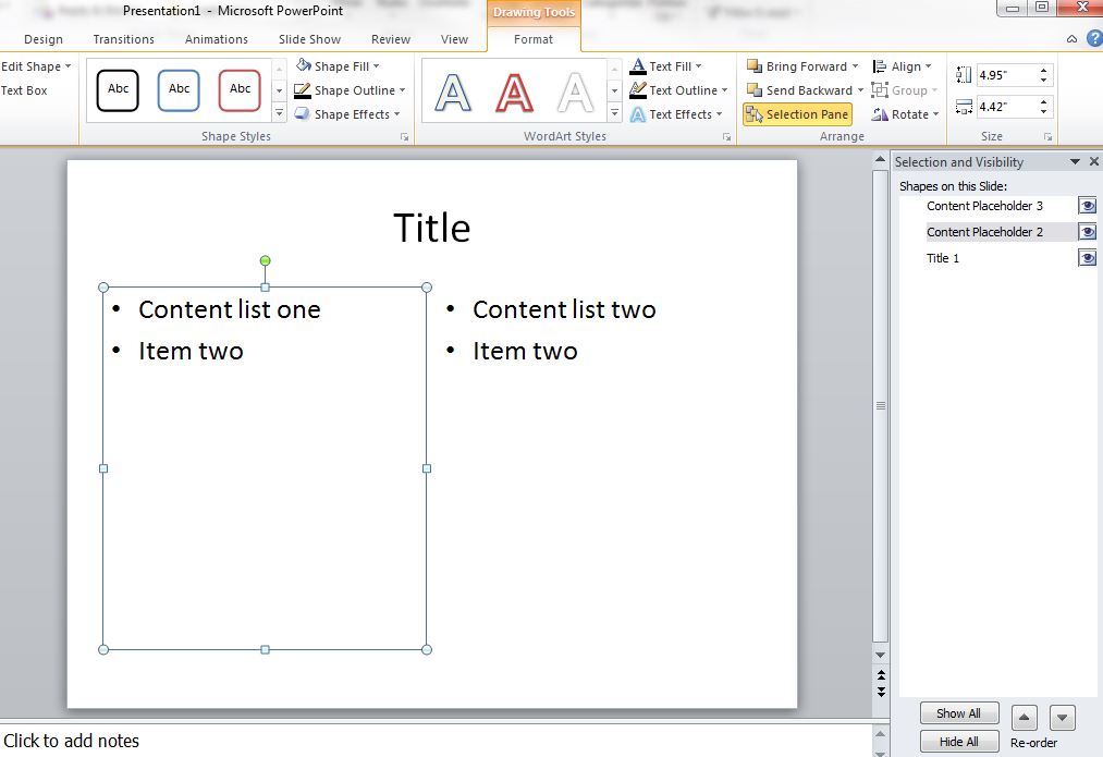
From Module 2: "To check the reading order of a slide, you can use the Selection Pane option under the Format ribbon (or the Arrange menu from the Home ribbon). The order in which items are read will be listed from bottom to top- the first item read will be at the bottom. You can use this tool to reorder the read order, if needed. Remember, the title should always be read first."